the challenge
Creating an identity for a project of this scale demanded more than design: it required visual strategy, clarity in communication and a sense of mission.
The objectives were clearly defined:
–
Create a name for the project.
–
Develop a logo that reflects the strength and dynamism of the rail sector, but also the cooperation among multiple entities.
–
Create a unifying graphic concept, applicable to all digital and print communication formats.
–
Design and develop an institutional website that would clearly communicate the project’s
mission, objectives and partner entities.
–
Produce complementary communication materials (press-kit, banners, event supports, digital content), ensuring visual consistency and impact.
The initial logo proposal had some limitations that needed to be addressed.
In terms of colour, the brushed steel texture made it difficult to reproduce in simplified versions, such as black and white.
Regarding form, although the first version suggested movement, the perspective was not technically well resolved.
Our approach involved reconstructing the symbol based on a grid, which not only corrected the perception of movement but also created a consistent geometric foundation for developing visual patterns applied throughout the graphic system.
The shape of the train was softened to harmonise with the new typography of the “TrainSolutions” name, taking advantage of the rounded lines of the font to create a better balance between symbol and lettering.
To address the colour issue, we retained the two colours already associated with the project, red and grey, but applied a subtle gradient to emphasise the vanishing point, the sense of movement, and the structural logic of the grid.
the process
Naming with a Clear Destination
The project came to us without a final name. The mission was to find a strong, clear, and representative designation.
We held brainstorming sessions with symbolic, technical, and evocative approaches. After several iterations, the name TrainSolutions Portugal was born, direct, international, and true to its purpose: developing railway solutions made in Portugal, for Portugal and for Europe.
– Proposal developed internally by the Consortium.
Graphic identity: uniting movement, engineering and collaboration
The Consortium had already presented an initial logo proposal. Our mission was to bring precision and coherence. We refined proportions, adjusted typography and defined a cleaner, more functional symbol.
The symbol stems from the convergence of several lines, representing the union of all the entities involved and the energy that drives the project. We also created a modular grid that serves as the foundation for the entire visual system — textures, patterns, margins, hierarchies and compositions.
– TrainSolutions Portugal logo.
Global visual system
The identity could not live solely in the logo. We created a comprehensive graphic concept that guides all media: presentations, reports, signage, digital content.
The result is a coherent, technological and versatile visual language, capable of accompanying the project on any platform with its own personality and visual rigor.


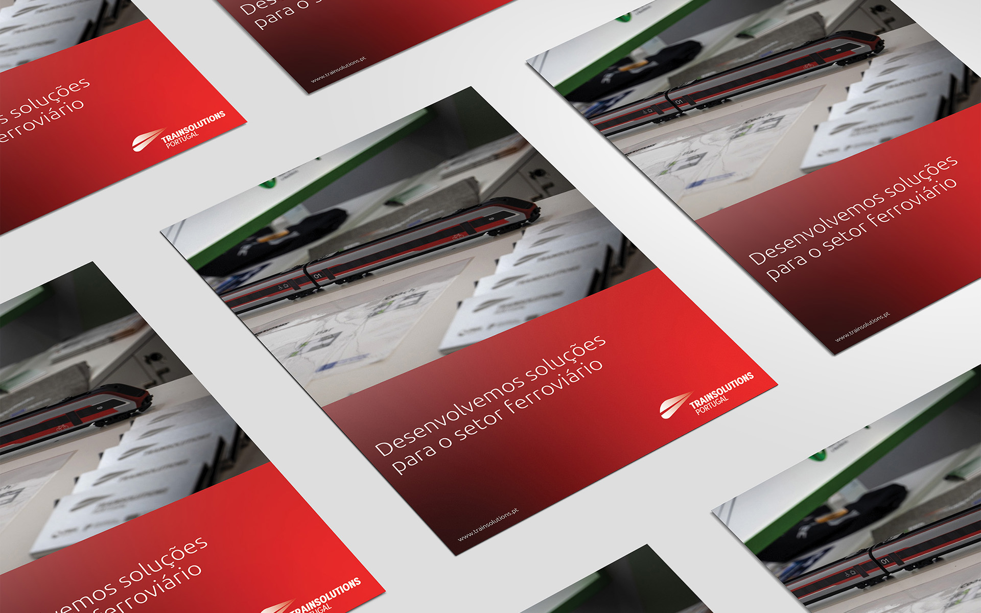
– Examples of printed materials.
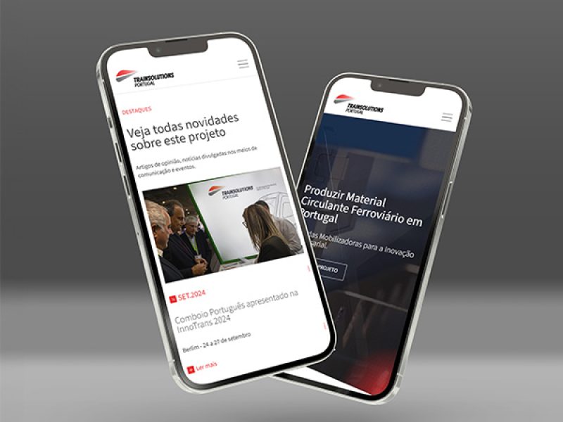
Institutional Website
The site was designed to be the main point of contact with the public. Structured clearly, with intuitive navigation, the website presents the key areas of the project, the consortium, the partners, news and a multimedia gallery.
Communication in motion
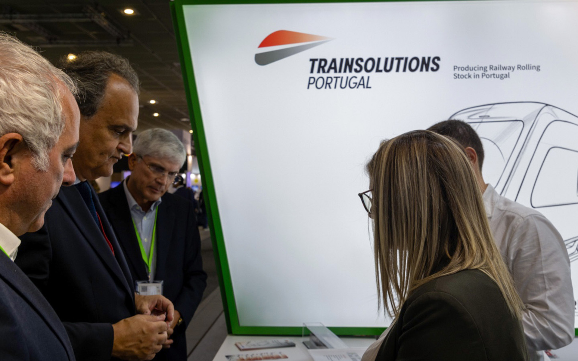
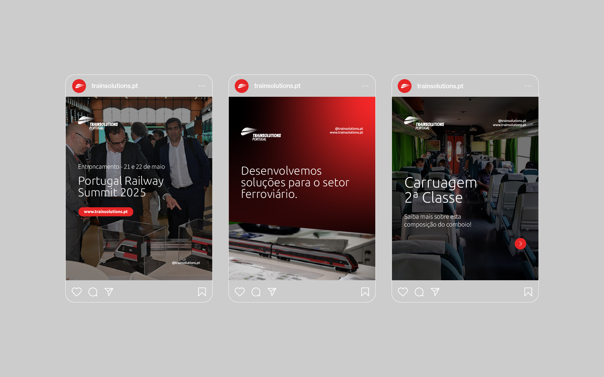
We developed a variety of communication support materials, from event materials (banners, roll-ups, physical supports) to digital and institutional content. The visual coherence across all material reinforces the professionalism, seriousness and impact of the TrainSolutions Portugal brand.


the result
The project successfully met the challenges:
–
The logo retained the essential elements of the original proposal, but gained clarity, proportion and impact.
–
The graphic concept proved robust and adaptable, ensuring consistency across all formats.
–
The website became the communication hub of the project, combining clarity, information and institutional presence.
–
The communication materials helped project the brand across diverse contexts, physical
and digital, technical and institutional.
More than creating an image, UTD helped transform a strategic idea into a powerful visual experience, aligned and forward-looking.
Today, TrainSolutions Portugal is a project with identity, voice and rhythm, ready to take the “Portuguese train” further.