the challenge
The Flour Mix range already had the right ingredients: natural, healthy, and gluten-free. What it lacked was packaging to match. The mission was to create a visual identity for the entire range, where each variety had its own personality, yet belonged to the same family.
We wanted something that was:
–
Visually irresistible (because, yes, we eat with our eyes);
–
Aligned with the brand’s values;
–
Easy to identify and use;
–
And, of course, ready to shine at any point of sale.
the process
Conversations with a taste of a briefing
We sat down several times with the Dony’s team to dive into the brand’s universe, understand the values of each product, and the impact desired on the shelves. Every detail, suggestion, or idea was recorded and transformed into inspiration for the project.
Inspiration in the form of samples
We received physical samples of the packaging, tested materials, textures, and formats. We imagined each product on the shelf, in the consumer’s hand, in the kitchen. Everything was designed to convey authenticity and naturalness.
Creating with hands in the dough
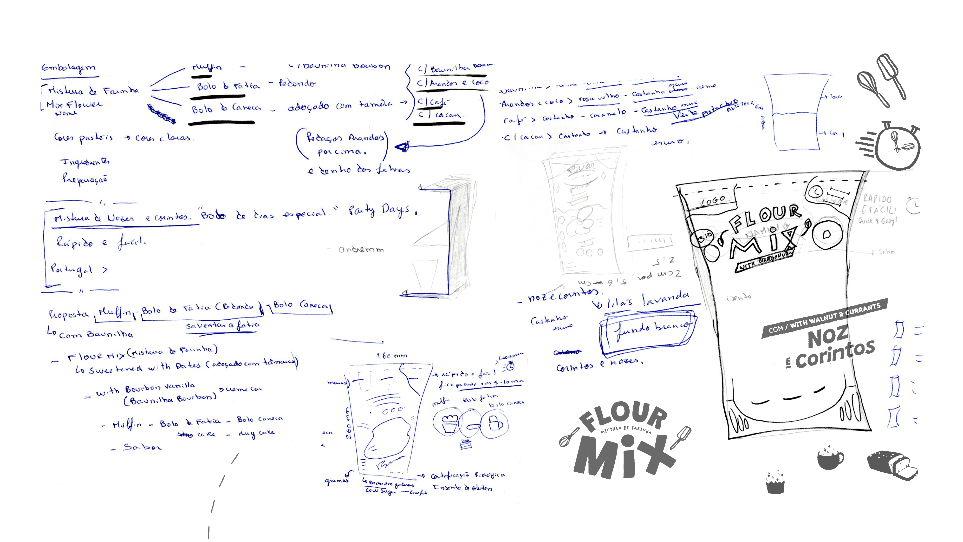
The creative process began with sketches, doodles, and brainstorming sessions. As with any good recipe, we kept adjusting the visual ingredients until we found the right balance:
Expressive typography for the Flour Mix range, combined with simple, clear fonts for additional information.
Realistic illustrations of the ingredients, almost as if they had just come out of the kitchen.
Icons and symbols to ensure clarity in the instructions and highlight certifications (organic, gluten-free, etc.).
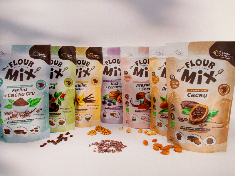
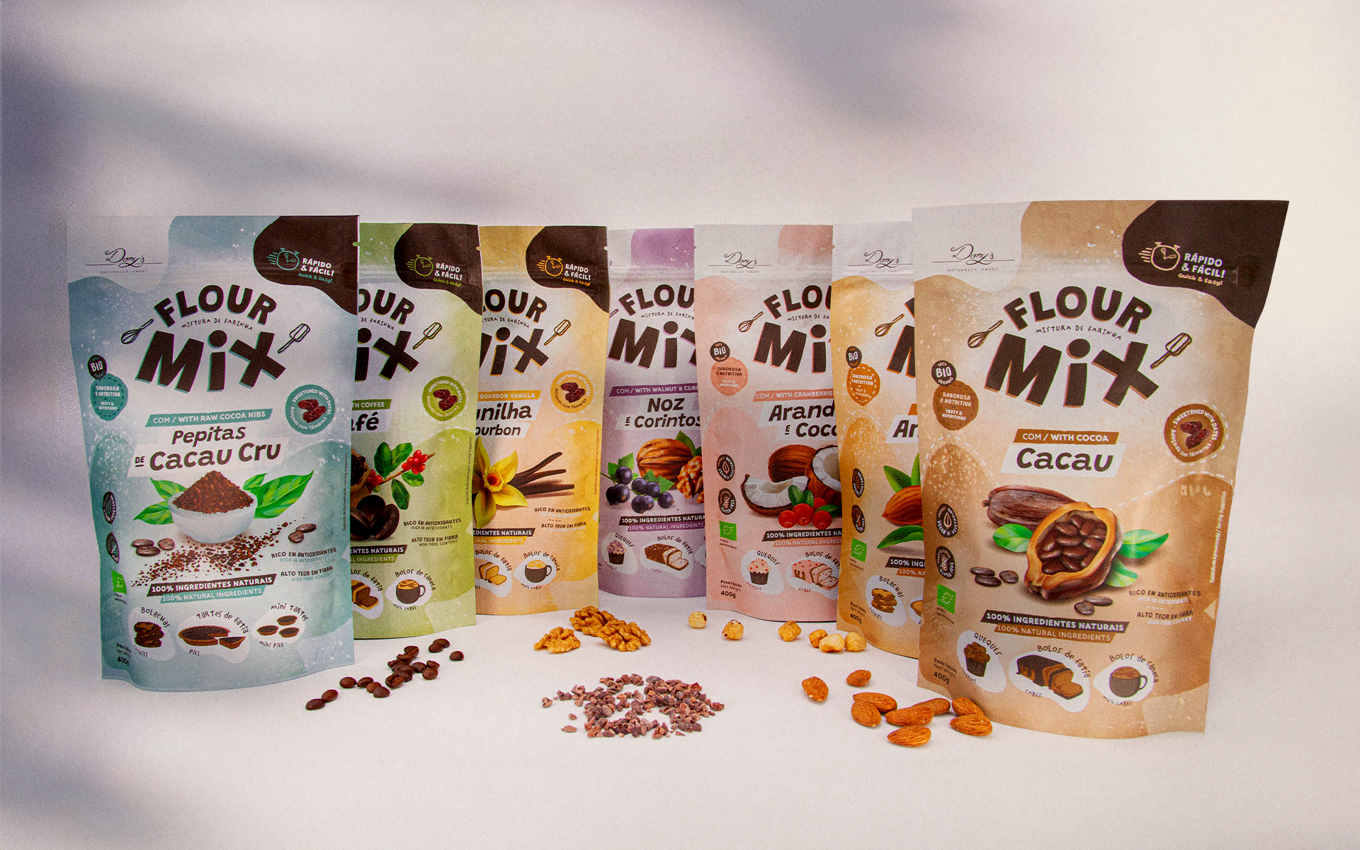
A custom colour palette: each flavour was given a colour inspired by its ingredients (vanilla, coffee, cranberries…), creating unique packaging that, together, works as a cohesive and appealing collection.
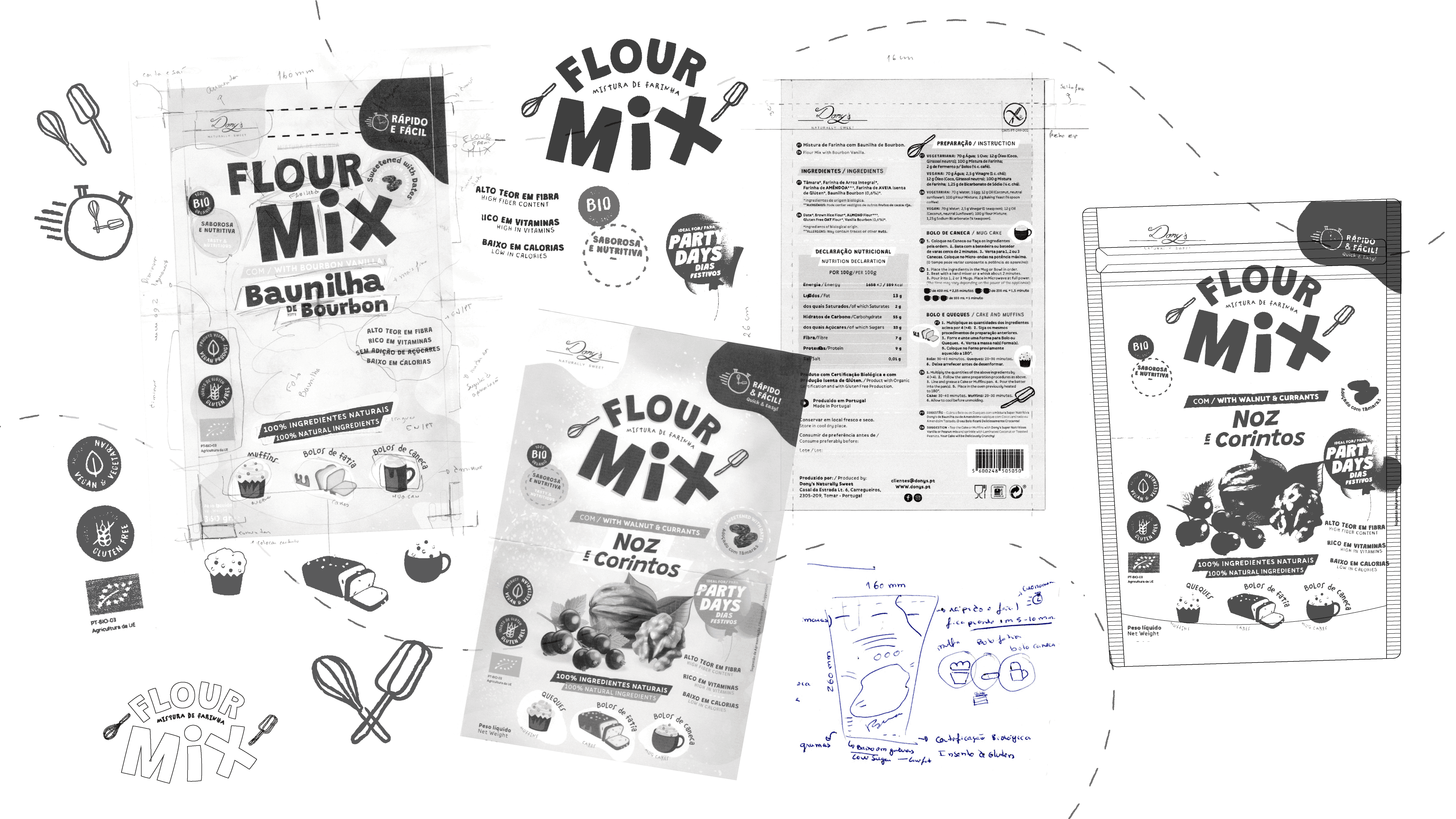
Prototyping & Feedback
We created physical prototypes, testing ergonomics, legibility, and visual impact. With the client’s feedback, we refined every detail, just as one would adjust a recipe before putting it in the oven.
Final Artwork Perfected
Once everything was approved, we prepared the final files with the same care as a pastry chef dusting sugar: margins, colours, cuts, and finishes. Everything ready to ensure the print faithfully reflected the envisioned design.

the result
The result is a line of packaging that stands out, captivates with its simplicity, and conveys trust. Each flavour is easily recognisable, and all the products together tell a coherent visual story — healthy, practical, natural, and full of flavour.
More than just a set of packages, we created a brand experience. Today, the Flour Mix range is ready to conquer kitchens, share joyful moments, and show that design can also be an essential ingredient.

