the challenge
Innovating while maintaining the soul: this was the premise that guided the entire project. How to modernise without losing the charm of the origins? How to transform each point of contact into an emotional experience?
Our approach involved reimagining the key points of the brand:
–
Shop windows and walls as vehicles for storytelling.
–
A van as a travelling messenger of affection and tradition.
–
Website for storytelling and facilitating contact with customers.
–
Menu and promotional materials to communicate specialities in an appealing and consistent manner.
Rather than applying “ready-made recipes”, we engaged in active listening, strategic analysis and a desire to connect the past and the present.
the process
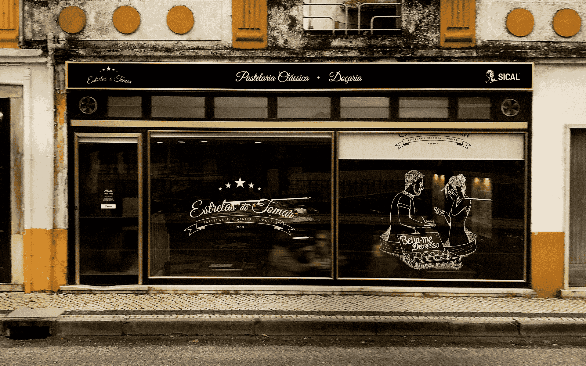
Before colours or sketches, we immersed ourselves in the stories that make Estrelas de Tomar’s heart beat, stories of people, encounters and legends, such as that of “Beija-me Depressa” (Kiss Me Quickly): a simple gesture that became a sweet and eternal metaphor. This narrative was the guiding thread of the project, inspiring shop windows, vans, graphic materials and digital presence.


– Illustration of the scene “Kiss Me Quickly”
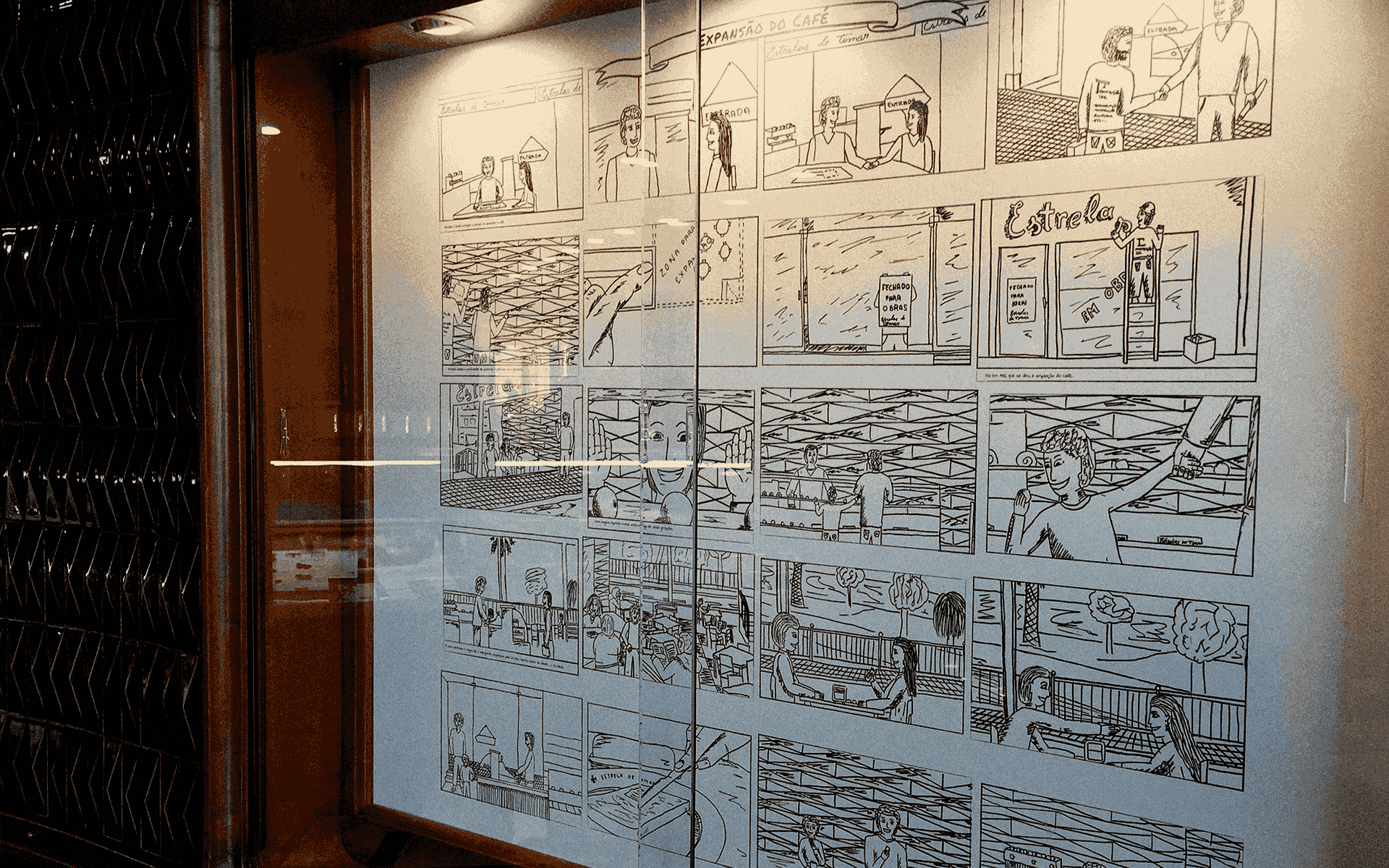
Space Design and Experience
The interior of the space was designed as a “living book” of Estrelas de Tomar. Five comic strip panels tell the story of the brand’s evolution, from its foundation to its new management and expansion, using simple and emotional strokes. Each panel is a page that customers can “read” and feel, creating a genuine connection with the story.


– Recording of the graphic process of the illustrations


The Van Design
More than just a vehicle, the van has become a mobile invitation. The graphic design reflects the shop’s identity, highlighting the scene from “Beija-me Depressa” in a romantic and cinematic illustration. It is a detail that arouses curiosity and smiles on the streets of Tomar, taking tradition even further.

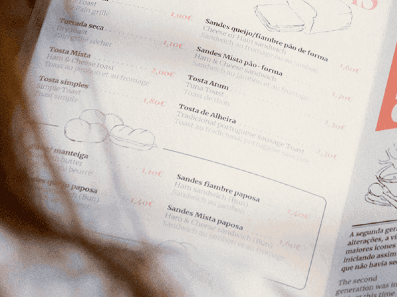
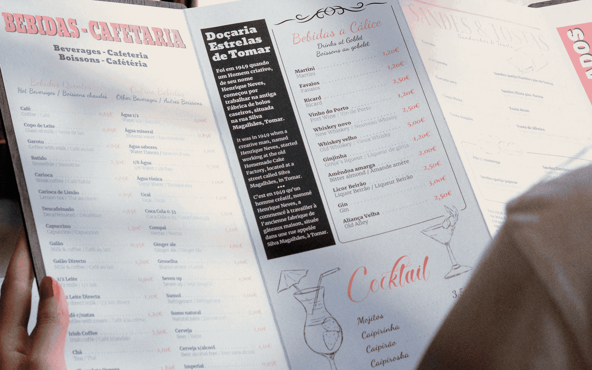
The Menu
The menu was designed to be clear, appealing, and consistent with the visual identity:
Dark wooden cover with an embossed logo, evoking sophistication and tradition.
Modern and functional interior, in three languages (PT, EN, FR), making reading and accessibility easier.
Delicate illustrations and a soft colour palette reinforce the artisanal character.
A central section is dedicated to the history of Estrelas de Tomar, turning the menu into a narrative piece.
Choosing a product is no longer just an action, it becomes a sensory and emotional experience.


Promotional Flyer
We created an elegant and visually appealing flyer to showcase offers and specialities. More than just a leaflet, it is an extension of the brand, reinforcing authenticity and tradition while inviting customers to visit the shop.


Website
The website was developed as an immersive digital experience, going far beyond an online showcase. It allows visitors to explore the history of the confectionery, discover products, and place orders in a simple and intuitive way. The colour palette, typography, and navigation were carefully designed to reflect tradition and authenticity, ensuring a consistent experience across all channels.
the result
“Estrelas de Tomar” has renewed its physical and digital presence without losing the essence that made it a local icon.
The shop has become a vibrant space where stories move and engage.
The van travels through the city, bringing tradition and curiosity to every corner.
The menu turns the choice of sweets into a sensory and educational experience.
The flyer reinforces communication with charm and authenticity.
The website broadens the brand’s reach, connects tradition with modernity, and brings customers of different profiles closer.
The result is a strengthened, modern brand that remains deeply rooted in local culture. Estrelas de Tomar has succeeded in modernising with sensitivity, creating sweet and lasting memories at every touchpoint.
