the challenge
This was not just a rebranding project. It was a transformation on several fronts:
–
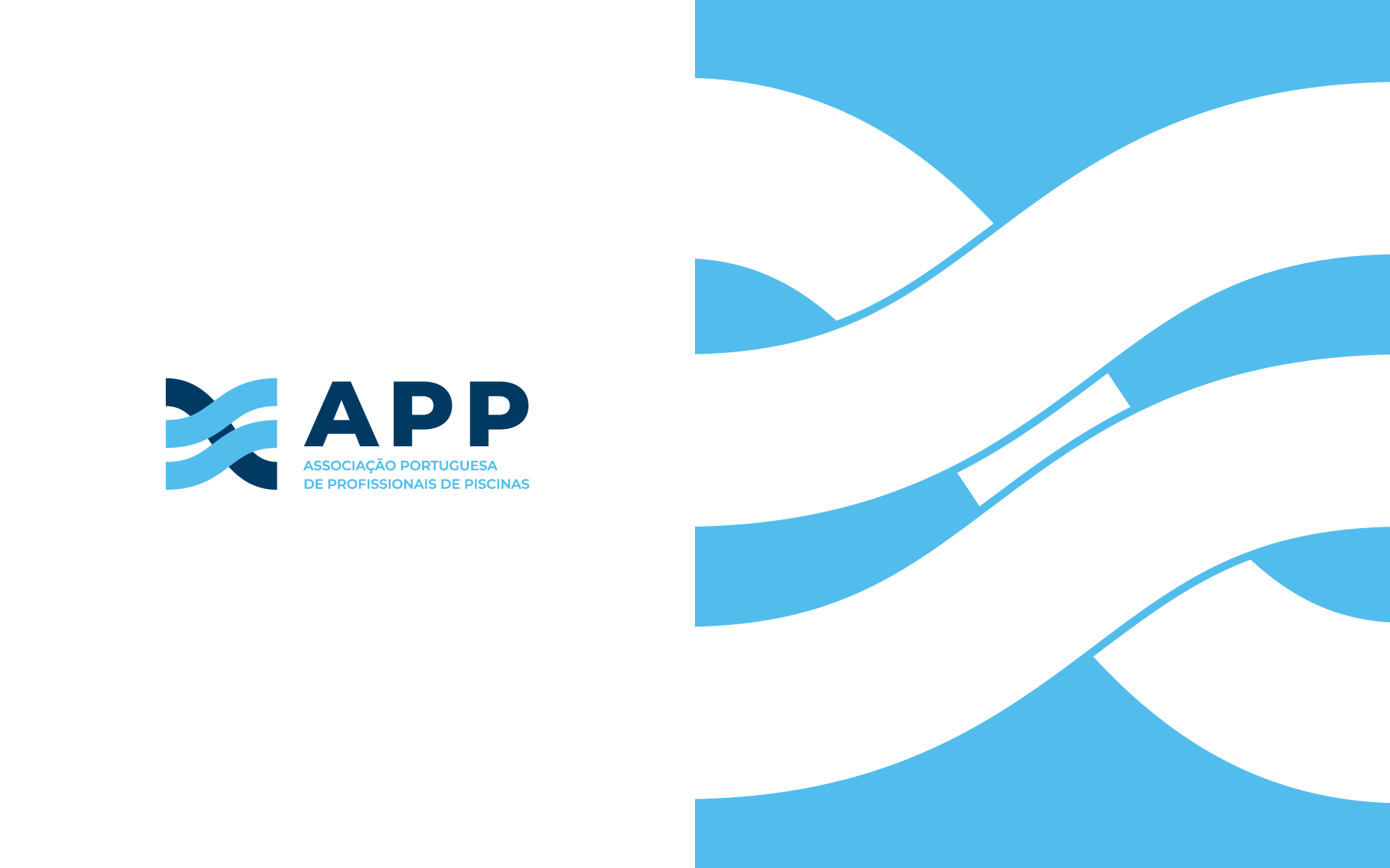
Update the logo after 20 years, keeping symbolic elements but giving it a more contemporary and versatile design.
–
Restructure the website so it can serve two distinct audiences: end consumers (homeowners) and sector professionals.
Organise the members’ area, with clearer menus, logical navigation paths and easier access to documents, events and forms.
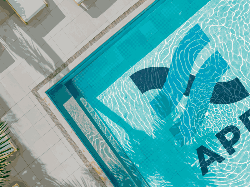
Create a new B2C section, with useful content, accessible language and an interactive map to find accredited professionals by region.
–
Produce a 25th-anniversary video, with an innovative approach and a forward-looking narrative.
In summary: giving new life to the APP image, preserving its legacy and opening the way for the next decades.
the process
Rebranding based on what is already recognised
We didn’t erase the history, we refined it, like tuning a meaningful melody. We preserved the movement and fluidity of water, an essential part of APP’s visual identity, but redesigned each shape with greater lightness, harmony and intention.

The new logo is a synthesis of past and future: it continues to evoke the sector it represents, but with clearer lines, more balanced proportions and a presence that naturally flows between digital and physical contexts. A cleaner, more modern image, yet still recognisable to those who have known it for years.

Website: a useful space for everyone
We created a website that guides users right from the start: “I am a Homeowner” or “I am a Professional”. Each path contains tailor-made content:
For end consumers: maintenance guides, simplified articles, FAQs, an accessible glossary and an interactive map of accredited professionals, allowing users to find services in their area and view full profiles.
For professionals: advanced technical content, legislation, events and a direct connection to the association.
For members: reorganised menus and quick access to reports, forms and essential documents.
Anniversary video with a future-driven vision
As part of APP’s 25th-anniversary celebrations, we produced an institutional video with a futuristic tone, supported by artificial intelligence tools. The result is a visually striking piece that summarises the association’s journey and projects its strategic vision for the future of the sector.
the result
More than an aesthetic update, the new APP logo represents a natural evolution, a rejuvenated identity that remains faithful to its origins and to the energy of the sector it represents. The new APP website now reflects what the association has always stood for: usefulness, proximity and trust. A living platform that informs, guides and connects people and companies in the pool sector. The 25th-anniversary video was not just a celebration; it was a statement of intent. It highlighted the path travelled, reinforced APP’s role in the sector and projected a clear future vision where innovation and unity remain the association’s pillars.
More than an aesthetic renewal, this project was a structural and strategic upgrade. APP is now ready to continue leading the sector, with a strong voice, presence and an identity that matches its ambition.