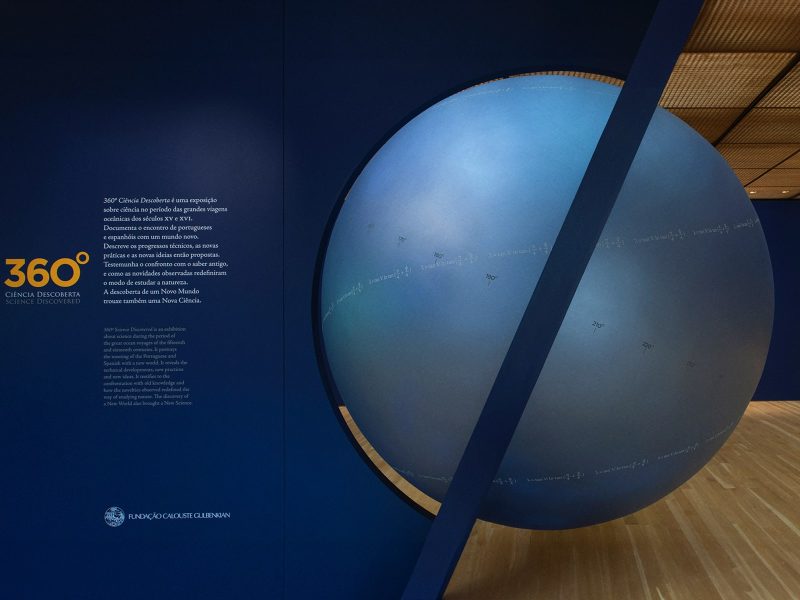
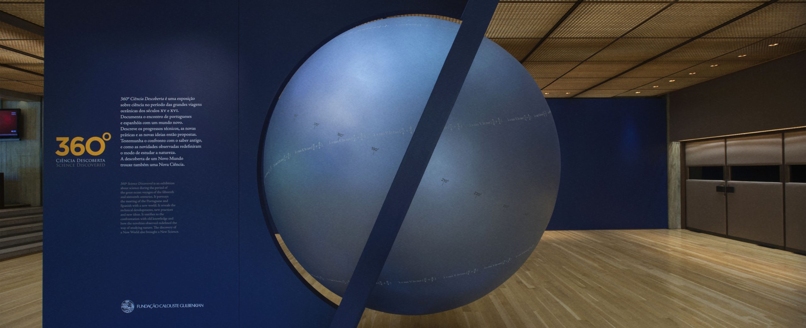
the challenge
The challenge was clear: to transform highly complex scientific and historical content into accessible, engaging, and rigorous visual experiences.
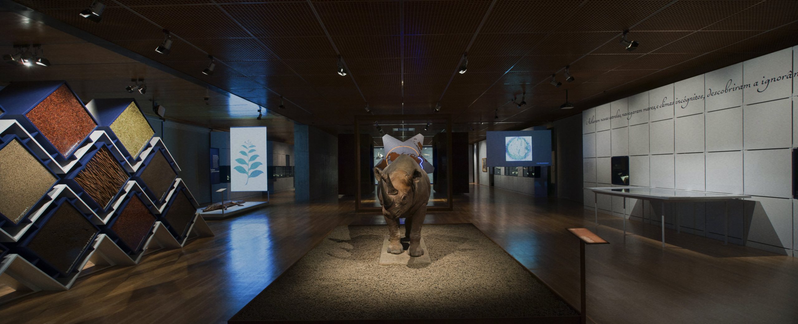
More than illustrating, it was necessary to educate, without compromising aesthetics, academic rigour, or harmony with the developed museography. The multimedia component had to be an integral part of the exhibition narrative, not merely a technological accessory.
the process
Planning and Curation
In collaboration with the exhibition’s scientific team, led by Henrique Leitão and with art direction by Luís Moreira (Overshoot Design), the pieces to be developed were defined. From the outset, the focus was on visual and conceptual coherence across all elements of the exhibition.
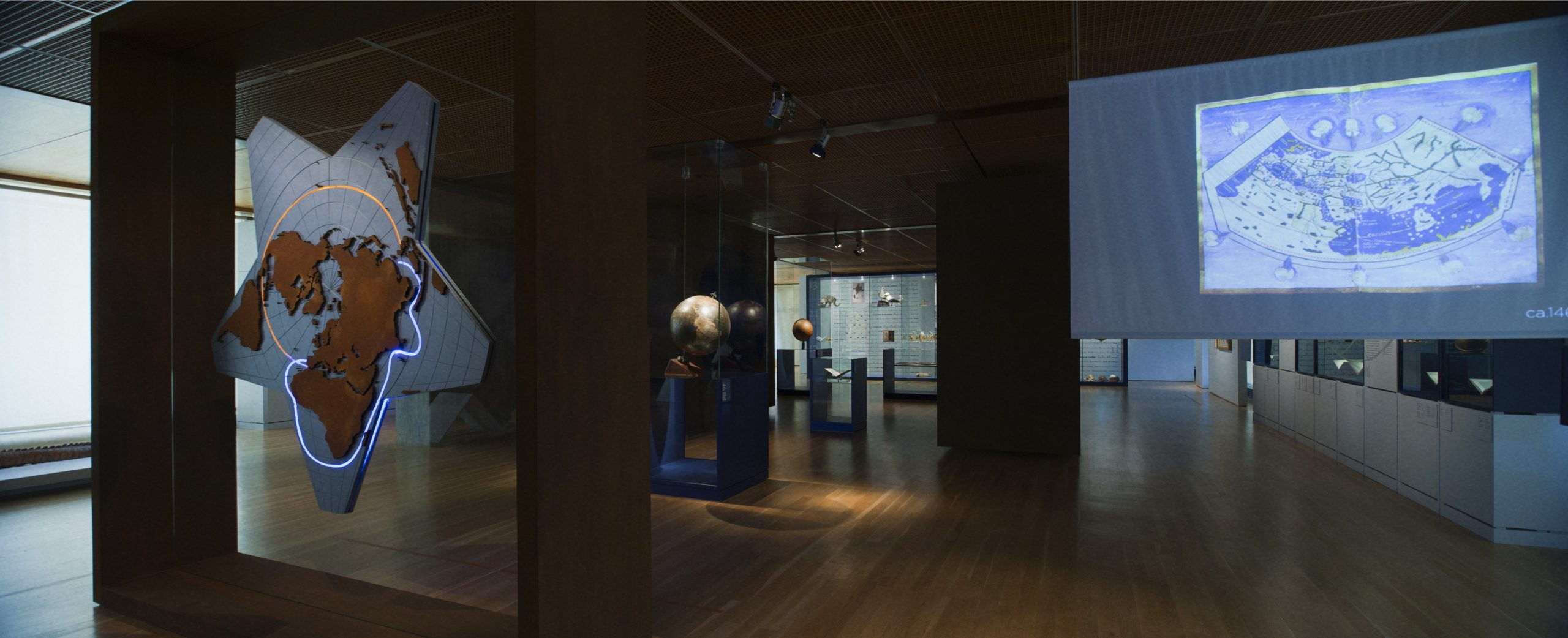
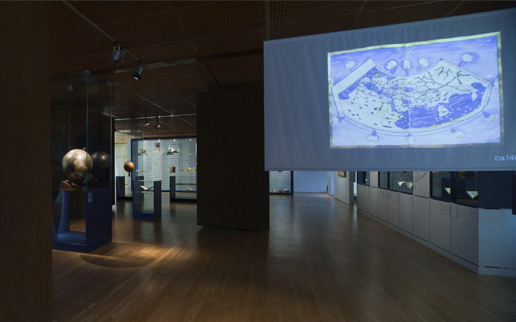
Morphing Video — “The First World Maps“
To illustrate how geographical knowledge evolved, we developed a video using morphing techniques between several historical maps. Each transition was built around common geographical points, creating a smooth animation that visualises, almost poetically, the expansion of the known world over the centuries.
– Morphing video: “The First World Maps”
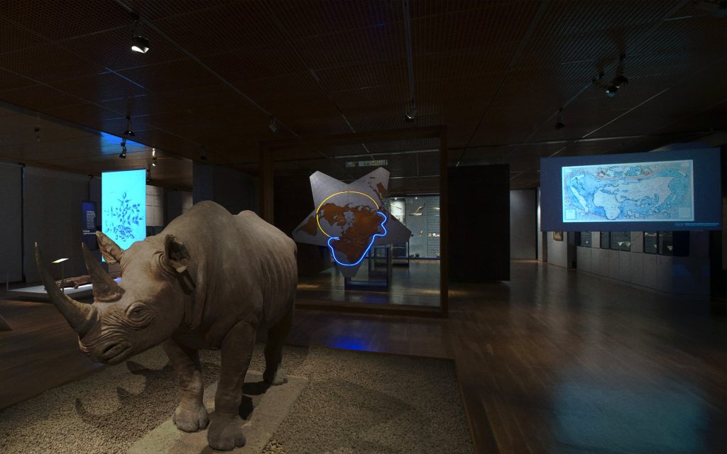
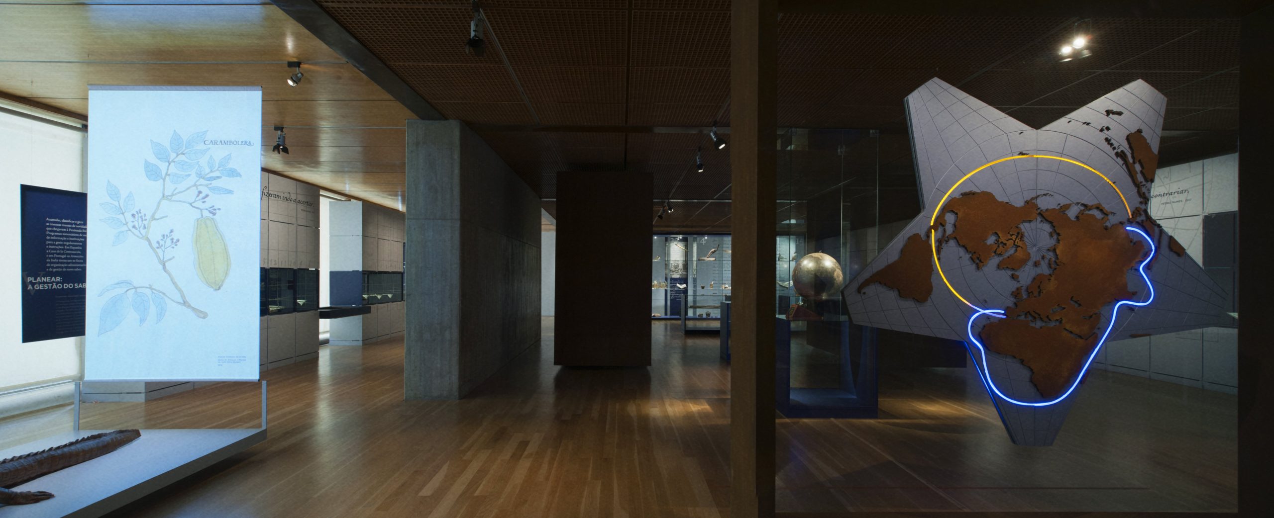
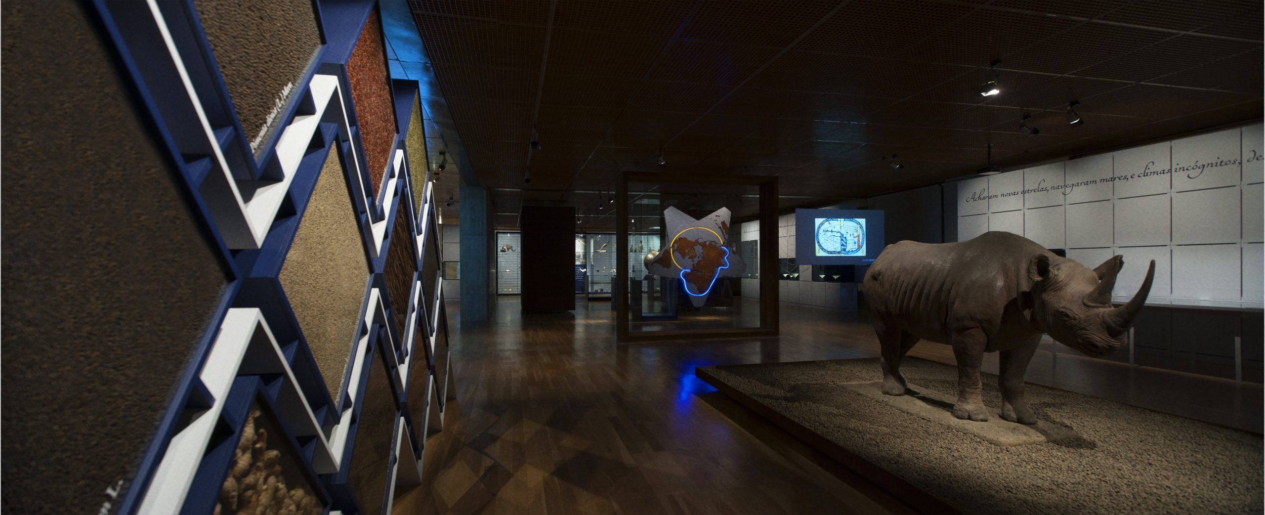
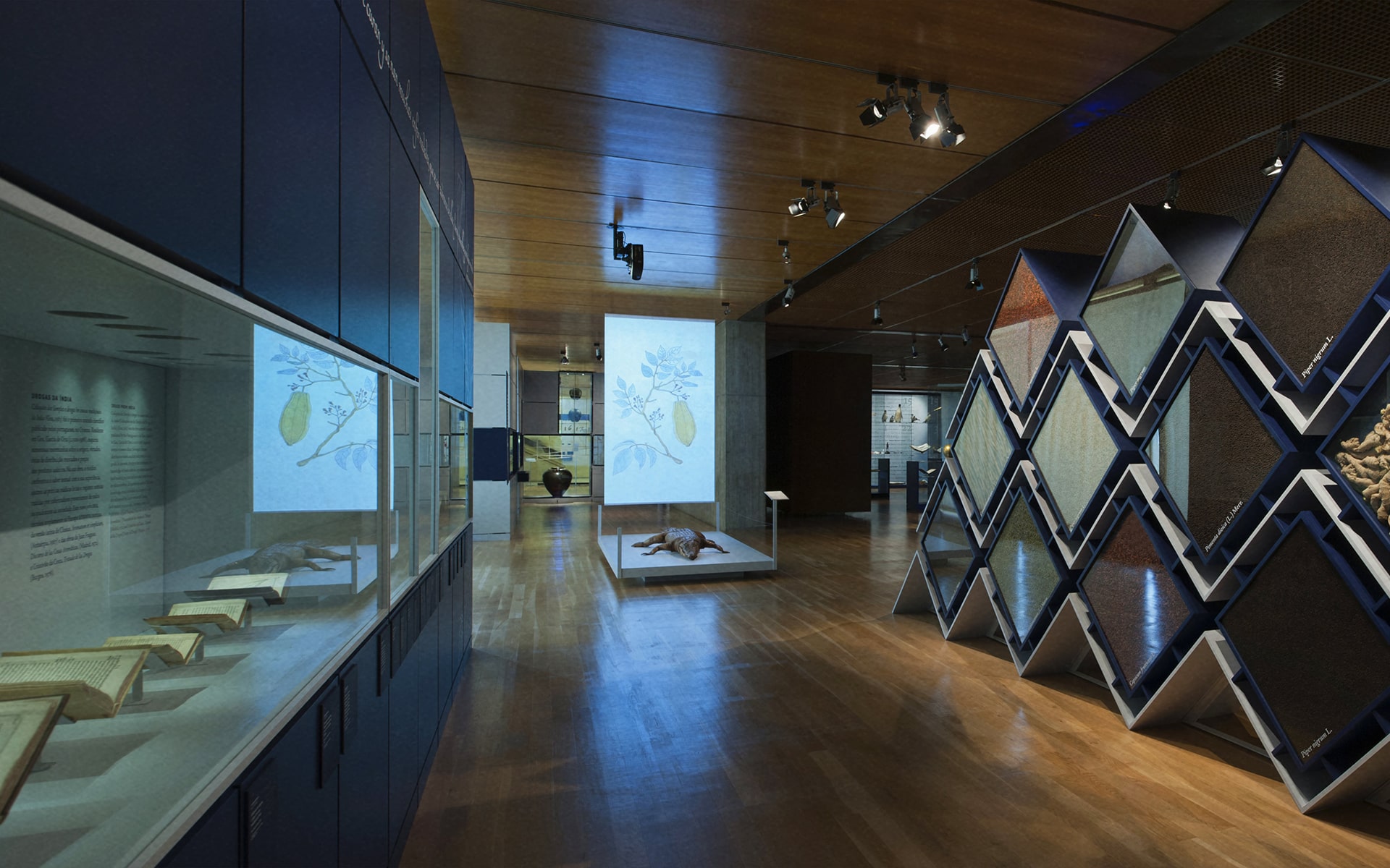
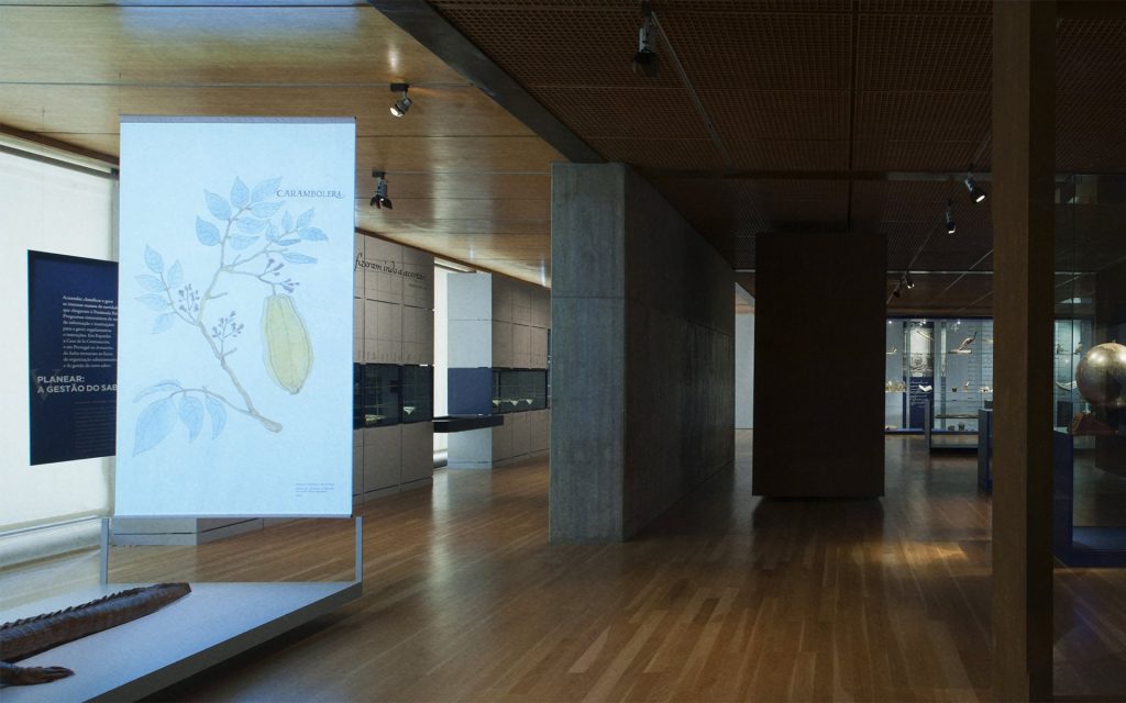
Thematic Animations
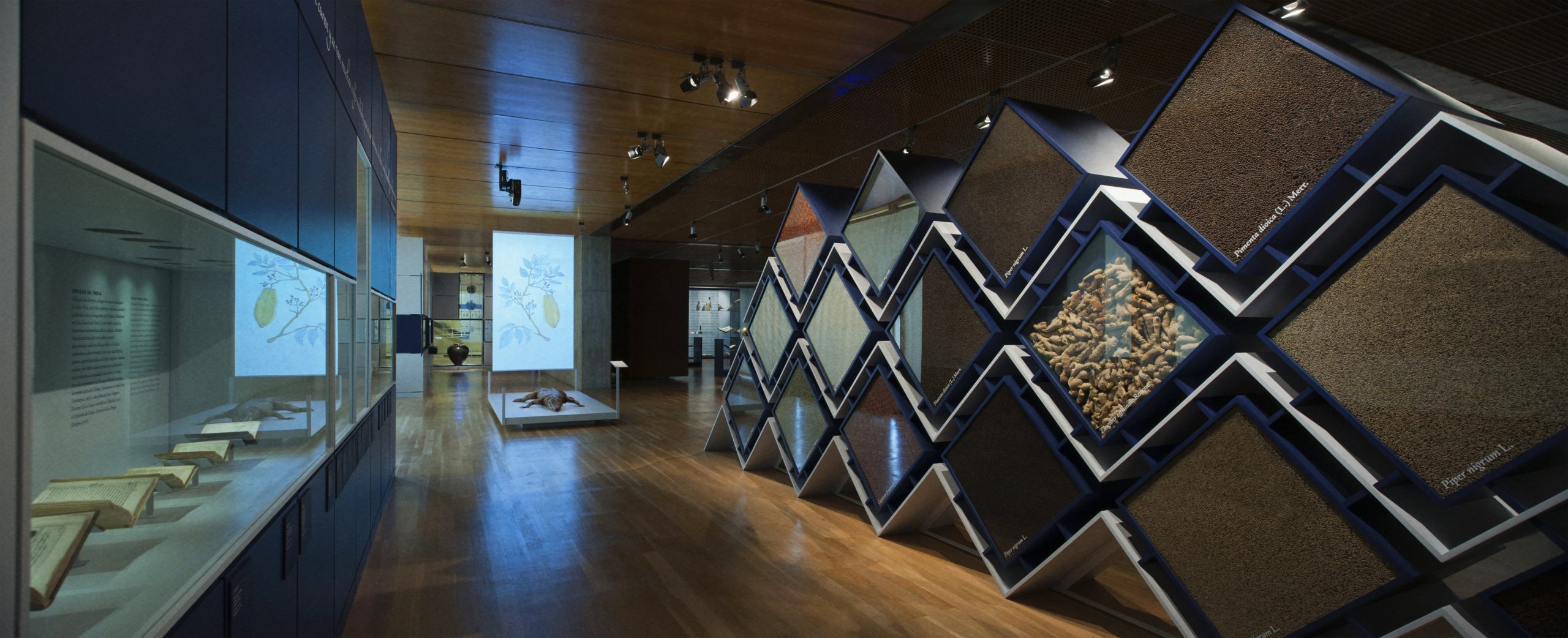
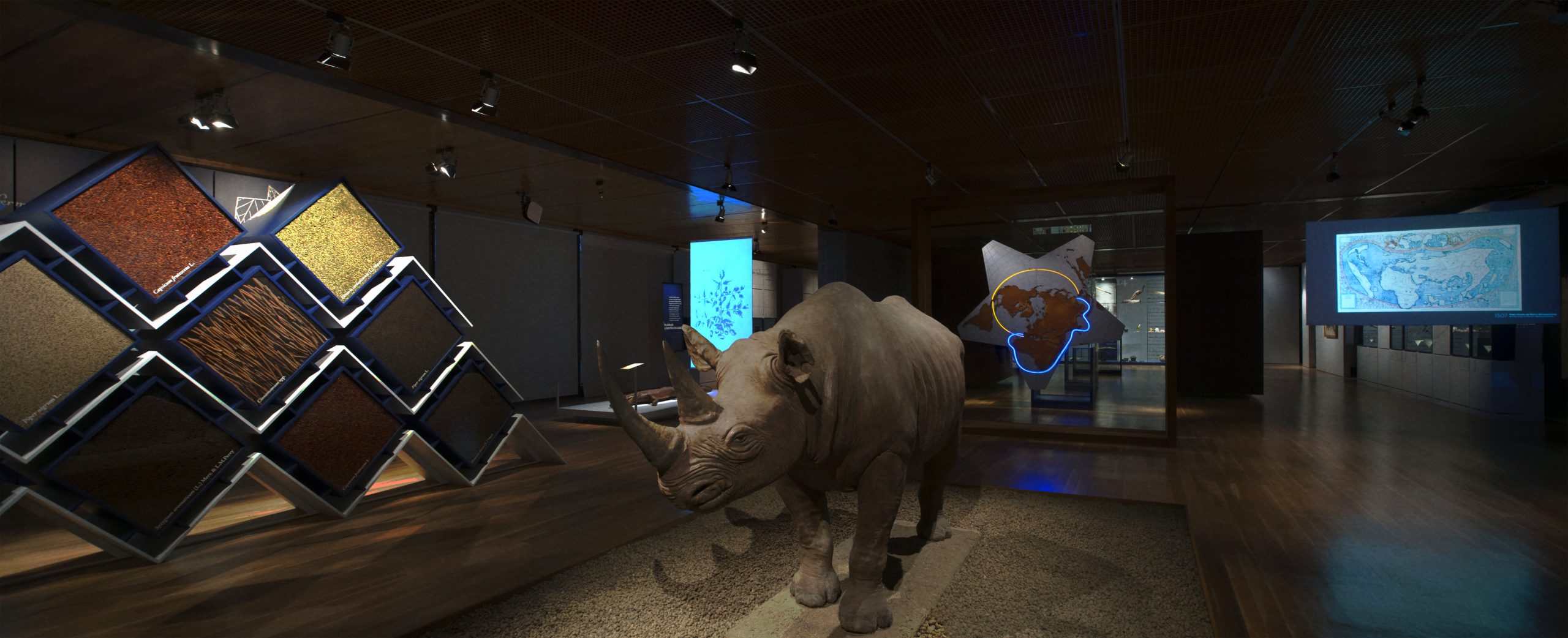
Five original animations were created and integrated into the exhibition panels, bringing to life botanical illustrations, scientific instruments, and maritime routes. Using stroke animation and motion design techniques, we recreated the lines of old hand-drawn illustrations, adding movement, rhythm, and visual clarity to the pieces.
– Video with “botanical illustrations“
Interactive Cantino Planisphere
One of the central pieces of the exhibition was an interactive video featuring the famous Cantino planisphere, created in 1502.
Developed for a touchscreen, the content allowed users to explore the map as it was during the Age of Discoveries, with navigation through arrows and interactive zones. Each region revealed additional historical content, always within an intuitive interface fully integrated with the exhibition’s visual language.
– Interactive video with the “Cantino planisphere“
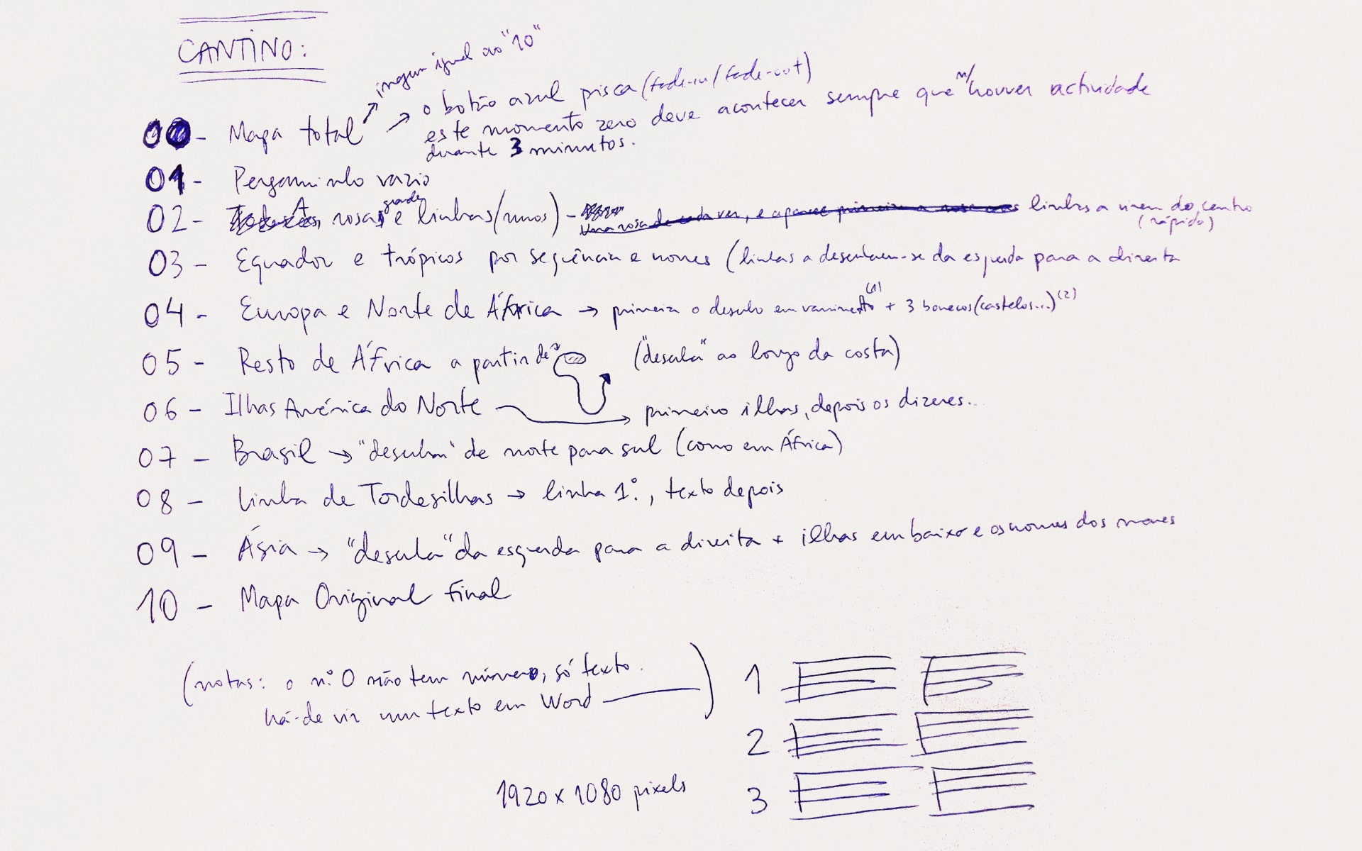
– Notes for the “Cantino planisphere” video
Technical Installation and Testing
All content was prepared for projection in a museum context, with special attention to legibility, colours, and narrative coherence. The UTD team supervised the installation and technical calibration on site, ensuring that everything functioned as intended and integrated seamlessly into the exhibition space.
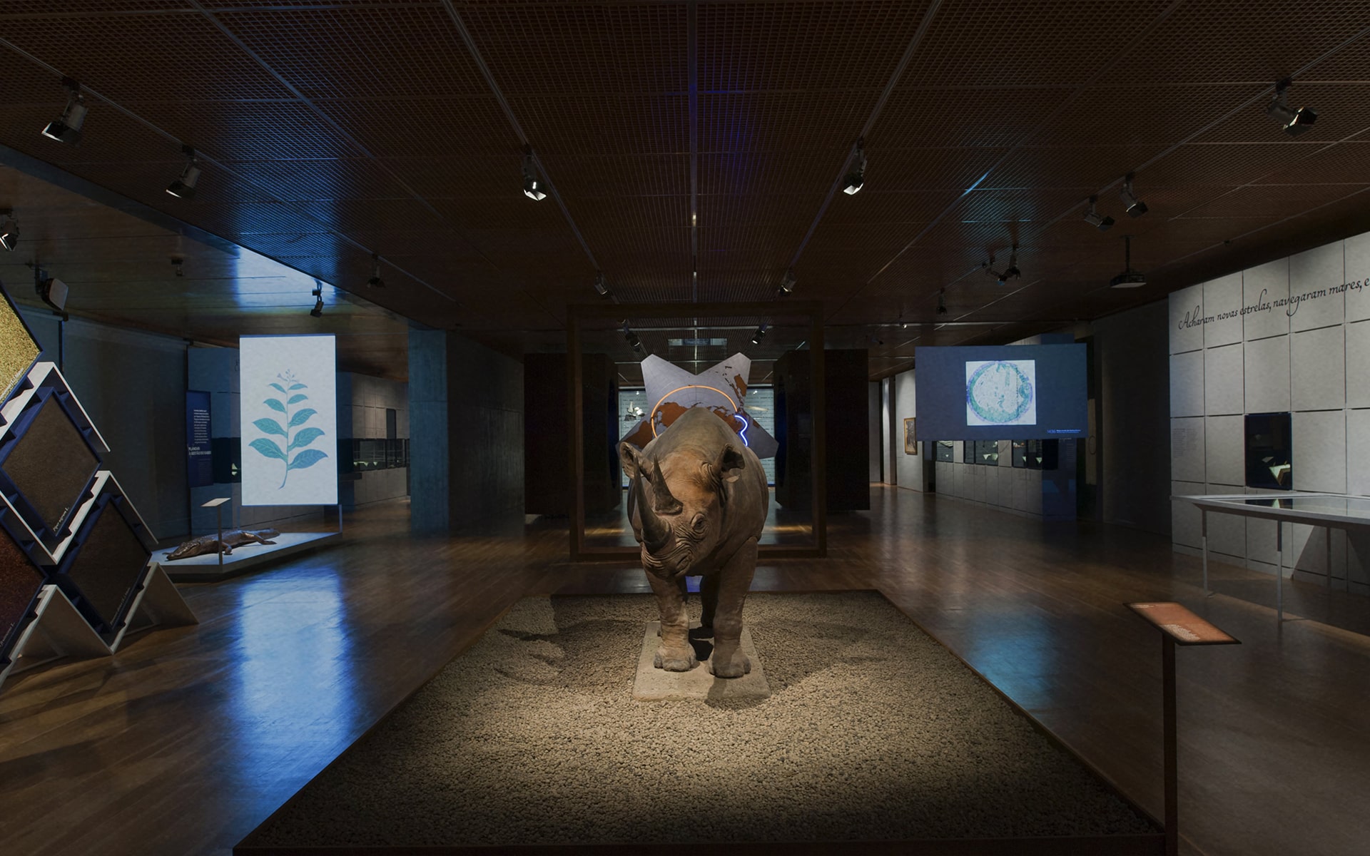
the result
The multimedia component became one of the pillars of the exhibition, providing moments of discovery, interactivity, and emotional engagement.
The morphing video between maps and the interactive Cantino planisphere stood out as key highlights of the visit, enhancing understanding of the topics and sparking audience interest.
The APOM awards, recognising Best Exhibition and Best Museography, confirmed the impact of this collaborative approach, where technology serves heritage and education.
More than showcasing science: making it visible, perceptible, and memorable.
With design, rigour, and a healthy dose of curiosity, UTD helped transform maps, legends, and routes into living experiences, leaving room for discovery and wonder.